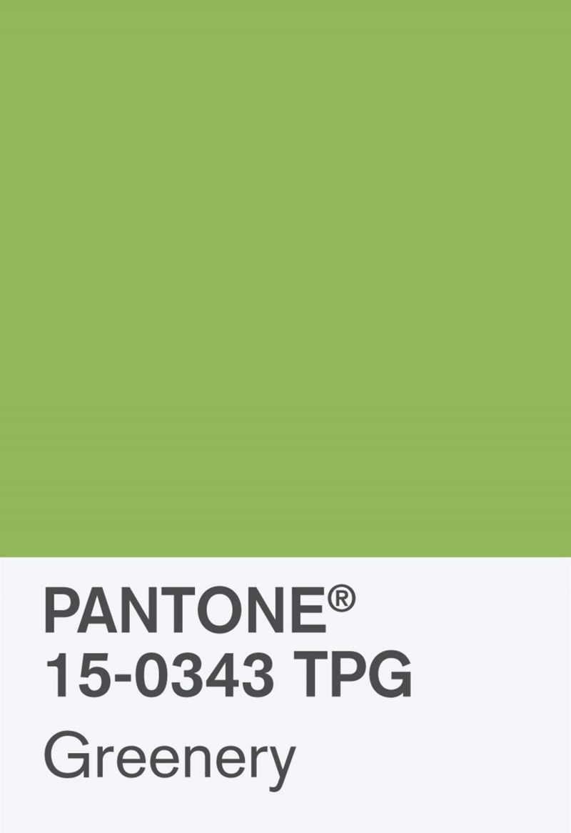
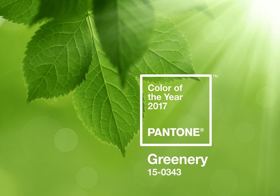
Pantone has chosen ‘fresh and zesty’ Greenery for the coming year.
“Greenery bursts forth in 2017 to provide us with the reassurance we yearn for amid a tumultuous social and political environment,” said Leatrice Eiseman, executive director of the Pantone Colour Institute.
“This is the colour of hopefulness, and of our connection to nature. It speaks to what we call the ‘re’ words: regenerate, refresh, revitalize, renew. Every spring we enter a new cycle and new shoots come from the ground. It is something life affirming to look forward to.”
For the past 16 years, Pantone has released a colour that embodies deeper societal trends, forecasting and influencing visual and design trends for the year ahead in homewares, fashion and industrial design, to name but a few.
As part of interior design, natural elements, terrariums, botanical-theme wallpaper, paint and accent furniture integrate the trend. A Greenery-painted wall or piece of furniture delivers a pop of colour, with the added benefit of creating the illusion of nature indoors, according to Pantone. Emotionally, it might improve self-esteem, reduce anxiety and heighten awareness of one’s surroundings.
Nature’s neutral, Pantone Greenery is a versatile “trans-seasonal” shade that lends itself to many colour combinations. It can be paired with neutrals, brights, deeper shades, pastels, and metallics.